Digital signage seems to be creating a lot of buzz in the digital world and why not?, they carry the potential to communicate with guaranteed engagement. But simply procuring a digital signage, uploading the content and getting started will not help you maximize its use. Along with a good quality content, digital signage placement is equally important.
Imagine spending ample time on creating attractive content strategy for your digital signage but there are not many visitors to have a look at them simply because the location of placement is not correct.
Today, we talk about how important it is to decide the right placement of digital signage so they can be utilised to the best of their capabilities.
Deciding Best Digital Signage Placement
Check where your audience has more chances of noticing your signage and place it there.
If you are a university that uses digital signage to circulate notices or schedules, then hallways are the best place to have them since students spend most of their time on hallways. Canteen is also a place where students spend their spare time so make sure to have digital signage installation solely for event circulars and schedules there too.

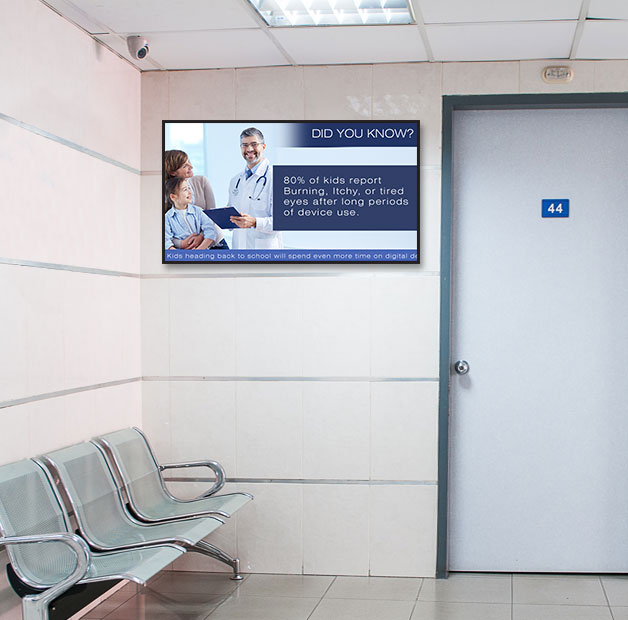
If digital signage screen are in a hospital, patients or their relatives tend to spend most of their time at the waiting area. This section can be utilized by hospitals to display their area of expertise, floor plan, the certified doctors working at the location and the certifications received to establish trust and reliability.
Corporate can place digital signage at the reception section to welcome new employees or clients, one at the center of the area where employees are seated so everyone can view the circulars and one in the canteen section to display menu as well as important urgent announcements.
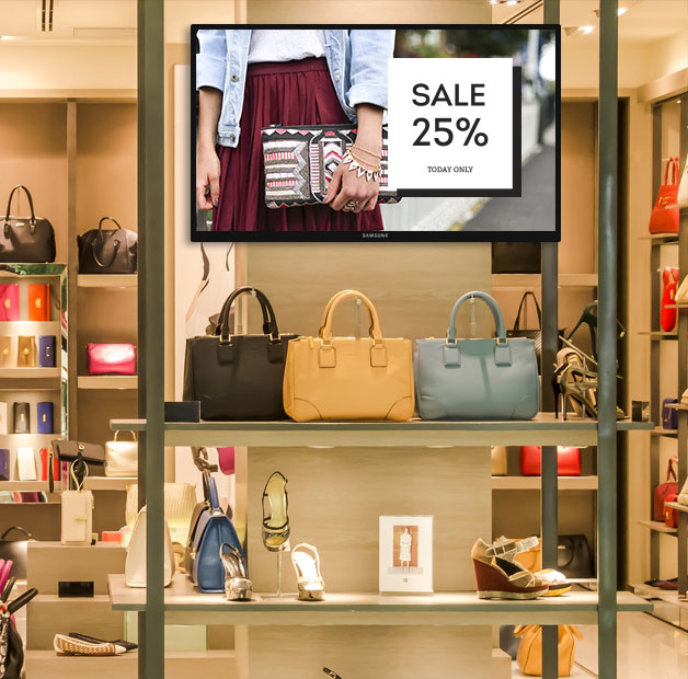
For a retail store, make sure to place a signage next to the trial section cause that is where you see everyone waiting to try the clothes on. Signage at the entrance can also be placed so visitors can know which offers to check out as soon as they enter the store.
Look at the content and decide the digital signage placement
This is again an important aspect that if miscomprehended, can ruin the charm digital signage have to offer. Imagine offers in your store products being displayed at the billing counter where people have already made their purchase and are about to pay. There would be no point to it.

Instead, if the offers are displayed at the entrance or at the trial area section, crowds can be induced to try them. Also if you are trying to induce new customers to walk-in to your store, offers can be displayed at the windows so the passersby can easily see them.
If you are a corporate who regularly updates its policies and normally a lot of announcements to make, then placing the signage at every cabin and the main seating area of the office makes more sense than having it at the entrance or reception area.
Consider the viewing height as well while placing the signage
The digital signage display should not be too high or too low. It should be placed as such that a person with normal height can view it easily.
The average eye level has to be considered while placing a signage meaning the eye-height of your target audience needs to be taken into consideration while placing the signage. Though different people have different heights, an average height that the majority of your audience possesses can be taken into consideration.
Again the height of the wall where the signage is going to be placed is to be considered. A wall too big in height should not have a signage that is placed to the ends of it but in the middle. Similarly if a wall is too small, the signage should be placed such that it looks good on it.
Take your surroundings into consideration
The main idea of having a digital signage is to make sure that it grabs attention. That said, it is important that the signage is placed in a perfect location where it has less competing elements around so more focus is given to it.
Let’s say if you are planning to have digital signage in your retail store of clothes, there is no point of having signage in between the shelves of clothing. If placed there, they would ideally be ignored or not noticed at all. On the contrary, if you place it at the entrance or at the start of your clothing section, this could work out in your favour.
Make sure that the wall where you have placed your signage does not have anything else around it as in it should be squeaky clean.
The color of the wall
We know you never saw this coming but yes, the color of the wall where you are going to place your signage also plays a very important role.

Wondering how? It all depends on the kind of mood and vibe you are planning to give with the signage. You could also go on to give a different color to the wall that is going to have the signage so it grabs attention easily if you have a large space.
Design team could go an extra mile to ensure that the digital signage content is displayed in contrast to that of the wall so the signage is noticed.
Put an extra effort on the surroundings
While digital display have a natural tendency to grab the eyeballs, if your area of operation is spread across a vast space, the part where digital signage have been placed can be made more appealing so users tend to notice them and get their eyes on the signage eventually.
A lot of offices tend to use architectural pieces or paintings to keep the office more appealing. If you are employing signage, make sure that the wall only has the signage and the appealing pieces are around on the other walls. By doing so, you are offering a clean look to your signage which ultimately gets attention.
Some signage are also used on a mount. In such situations, make sure that the mount is noticeable and placed at a location where it gets the most views.
The product in discussion and the signage should be placed in cohesion

The product that you are marketing or communicating for on the signage as well as the product should be placed next to each other so potential customers can understand your viewpoint and decide to check out the product there itself. There is no point in having the product somewhere else and the screen placement at another location. This would apply only if the signage is going to be used for a particular product.
If the digital signage is for the overall marketing of all your products, you can place it at a location where it tends to get more views.
Conclusion
The decision to have digital signage is important and so is the location you decide to place it. We have tried to cover most of our thoughts on things you should be considering while placing a signage.
Feel free to share your thoughts.
We, as DotSignage, offer versatile software solutions. You can reach us out on info@dotsignage.com for your inquiries or any queries in regards to placement of digital signage and we would be happy to assist. You can also try our 7 day free trial of our software.


